Have you ever noticed how colors impact you when you look at a work of art? It’s no secret that there is a deep connection between colors, emotions and art.
Nowadays, after analyzing business objectives, colors are carefully chosen to influence our mood or even our purchasing decisions.
But if we look back, we find a different perspective. What do I mean? At that time when emotions were what guided the artist’s hand, and his mood drew the canvas.
Marc Chagall, emotions on the canvas
For the French painter Marc Chagall, colors were life. He was one of the great masters of color in the 20th century, and his art was always at the service of his emotions and visions.
His works, inspired by both his cultural heritage and the avant-garde, are true examples of beauty and depth.
With elements taken from various aesthetic currents, Chagall developed his own and very recognizable style.
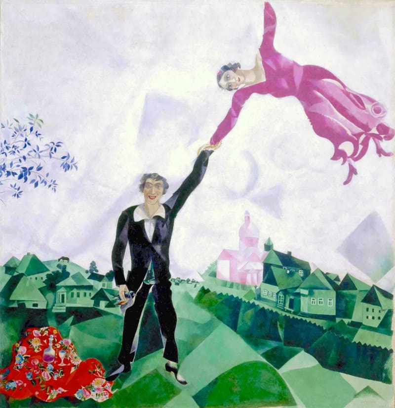
Paintings like “The Walk”, beyond telling a story that arises from his imagination or his dreams, reflect states of mind and moments of revelation.

Chagall found his inspiration in cultural identity, love, life and death. As the Thyssen-Bornemisza museum points out: “he combined certain elements of the Cubist avant-garde, Fauvism and the Orphism of Robert Delaunay to create a personal and unclassifiable style.”
One of Chagall’s most wonderful achievements is the sensation of movement he achieves in static art, through the superimposition of figures and colors.
And, if we talk about colors, emotions, art and movement, how can we not think of our beloved Vincent van Gogh.
Vincent van Gogh, a yellow world
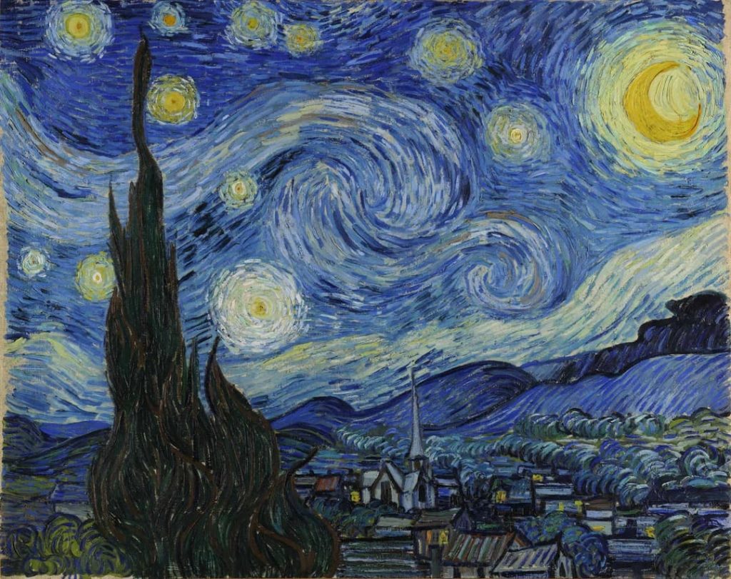
One of the artists who best captured movement in his works was undoubtedly Vincent van Gogh. In paintings like “Starry Night“, it is almost impossible not to perceive the vibrant movement of its swirls.

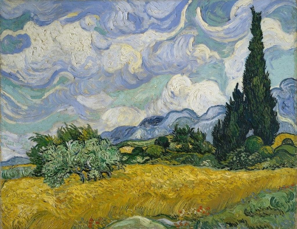
Even for me, van Gogh went a step further, including sensations in his paintings, such as in his work “Wheat Field with Cypresses” where, when looking at it, you can almost feel and hear the wind.

Perhaps, what moves and excites us when we see his works is how he knew how to capture the soul of the simple and everyday, transforming those moments into art.
As he wrote in one of his letters to his brother Théo: “Art is sublime when it is simple.”
As for colors, one of the distinctive elements of his paintings are the vibrant tones, such as yellow, blue and white, developed during the 19th century.
You may be wondering why yellow appears so frequently in his works. If you are interested in art, you may have heard some explanations about it.
According to some versions, Van Gogh’s preference for yellow could be related to digitalis (Digitalis purpurea), a medicinal plant that he used to treat his manic-depressive attacks, today known as bipolar disorder. Taking too much digitalis could cause xanthopsia, a visual disturbance that made everything appear yellow. This would explain the predominance of yellow in his paintings, reflecting how he perceived the world.
Dr. Paul Gachet, Van Gogh’s doctor, administered this medicine to him, and appears with a bouquet of digitalis in one of the portraits Van Gogh painted of him.
Additionally, some suggest that Van Gogh may have suffered from glaucoma, which would explain the “halos” in works such as “The Night Café” and “The Starry Night.”
Regardless of the reasons, Van Gogh’s work conveys exceptional emotional intensity and technical skill. His use of color and textures allowed him to create a unique visual language that has transcended time and space.
Color Psychology
Psychology has dedicated an entire branch to the study of the impact that colors have on our perception and behavior. Although many still consider color psychology a pseudoscience due to its subjective nature, this field explores how we perceive colors and how they influence our emotions and actions.
One of the pioneers in this analysis was Johann Wolfgang von Goethe. He believed that color also depended on our perception through the brain and sight. As he himself said: “When coming into contact with a certain color, it immediately synchronizes with the human spirit, producing a decisive and important effect on the mood.”
Despite his contributions, Goethe’s theory was criticized for not being supported by the science of the time.
Edwin D. Babbitt, a scientist and artist, inadvertently contributed to the development of color psychology. He proposed that certain colors could be associated with curing different health problems. Although his work remains recognized, the field has evolved significantly since then.
Almost 200 years later, psychologist and sociologist Eva Heller wrote the influential book “Color Psychology: How Colors Act on Feelings and Reason,” based on a study with 2,000 people from various professions in Germany.
Today, marketing and businesses use these ideas about colors and their emotional effects to build brands and create specific impressions. Additionally, colors are used to influence mood in decoration and fashion.
What color should I choose?
Let us back to the main topic, colors, emotions and art.
Each color has its own language, providing unique meanings and evoking diverse emotions in those who perceive it. Depending on the context, it can generate positive or adverse reactions.
Although the meanings may vary between cultures, in Western culture the colors are associated in the following way:
RED
Red is linked to extroverted and somewhat impulsive people, who tend to act without much reflection. It symbolizes passion, sexuality, energy, fire and blood. Its impact on mood is powerful: it can inspire courage and confidence to face fears, but it can also provoke aggressive attitudes. According to chromotherapy, red accelerates the pulse and heart rate, which could be tiring at the end of the day.
ORANGE
Orange is associated with eloquence and joy. It promotes optimism, self-confidence and emotional balance, being ideal for those who face self-esteem problems. In addition, it helps reduce fatigue and stimulates the respiratory system.
YELLOW
Yellow is related to wisdom, intelligence, mental agility and creativity in its positive aspect. However, in its negative aspect, it can symbolize anger, envy, jealousy and betrayal.
GREEN
Green has a sedative effect, representing hope, stability and fertility. It symbolizes balance, helping to maintain calm and serenity. It is commonly used to treat insomnia, fatigue, migraines and nervous excitement, as it lowers blood pressure and reduces heart rate. However, it can also be associated with madness.
BLUE
Belonging to cold colors, blue transmits serenity, confidence and calm. However, prolonged exposure can lead to sadness, melancholy, depression and fatigue. To maintain emotional balance, it is advisable to combine it with warm colors.
VIOLET
Violet is associated with intuition and spirituality. People who choose this color tend to be empathetic and affectionate, with artistic and creative inclinations. Helps reduce anxiety, phobias and fear.
WHITE
White symbolizes joy, purity and peace, and is related to innocence and pure love. It can convey confidence, although in certain contexts it can also suggest immaturity.
BLACK
Black is a color with both negative and positive connotations. It can evoke pain, despair, sadness, melancholy and irritability, but it is also synonymous with elegance, security and sobriety.
GRAY
Gray is perceived as a neutral color, associated with balance and order. It expresses elegance and respect, although it can also convey boredom and old age.
Whether you are considering designing original clothing, decorating your home, or simply choosing a color for your environment, I hope this information about colors, their emotions, and their impact on art helps you make the best decision.
The most important question is: How do you want to feel? Only you have the answer.
Have a lovely day.
